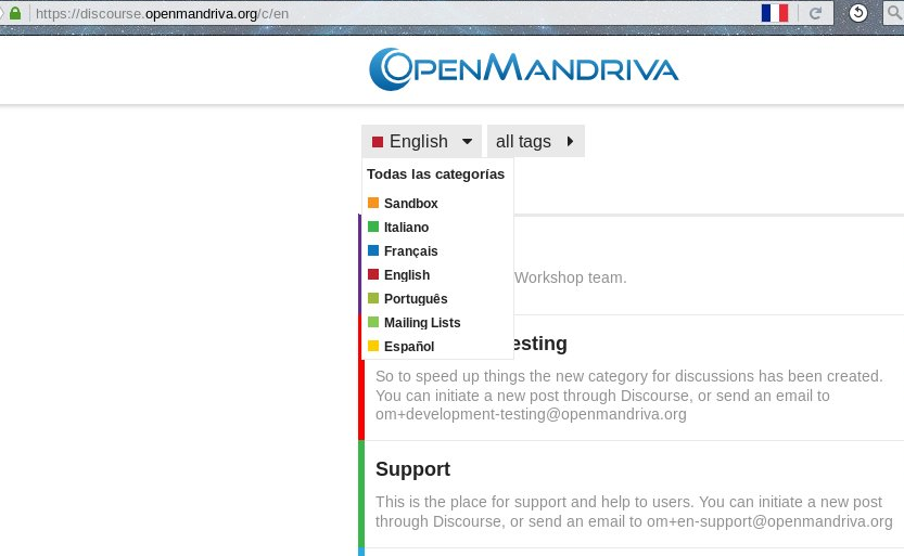
I can note some lack of visual uniformity in this site. For example, the “Support” category is colored green in French, English and Spanish languages. But it’s orange in Italian, and skyblue in Portuguese. “Resources” is blue in Portuguese and skyblue in English, but it’s violet in French. And “Announcements” is strong pink in English and skyblue in Spanish and Italian.
Can be those “categories colours” be standarized inside the site?
Another point of standarization can be to have the same categories in all languages. However, I understand this couldn’t be needed at all, as, except Italian, there are few messages in the languages different from English.
PS: I don’t know if this is the right place to post the question. I guess moderators can move the post to the right place.
Every language part has its own sub-categories.
In the ideal world yes for concistency some of them, the basic/more important ones, are arranged with the same tree pattern.
As you well noticed, except the Italian category in the other forums there are very few messages, so we can handle all this in case of need.
A lot of the languages also don’t have the same categories. The language I moderate, Spanish, people wanted a “free chat” and a place to post the translations of articles about OpenMandriva, while other language groups are more focused on support, and others still, the development of OpenMandriva.
I agree with the idea to let the users decide, in each language category, which sub-categories they want/need.
But if there is the same sub-category (1) in different language it should have the same colour, at least for the first level.
Would you propose a pattern?
(1): of course, the same sub-category has not necessarily the same spelling in different languages. For example, support in English is aide in French. This is one reason for keeping the same pattern.
I suggest whenever a category is the same or very similar to a category in the English forum, we should use the same colour, otherwise pick one. To try and keep uniformity between all the languages’ colours would be a linguistical and logistical nightmare.
Not only colour uniformity, but also language colours are “related” with a representative flag, except for Spanish !
English -> UK flag -> red, white and blue -> English is red.
English -> USA flag -> red, white and blue -> English is red.
Italian -> Italy flag -> green, white and red -> Italian is green.
French -> France flag -> blue, white and red -> French is blue.
Portuguese -> Portugal flag -> green and red -> Portuguese is green.
Portuguese -> Brazil flag -> green, yellow and blue -> Portuguese is green.
Keeping this thread related to the colours, I can see that “Mailing lists” also has green !! (which already belongs to Italian and Portuguese). So I think we can select a new colour to “Mailing” that probably don’t appear in flags too much, like purple or pink or brown.
PS: Now, “Sandbox” colour is similar to (new) Spanish, but I can distinguish them. I don’t see the need of change here. But remember orange is a colour associated to the Netherlands and Ireland. If Dutch is a language that appear in the future we can have the necessity of change “Sandbox”. You’ll see if this is a problem or not (it’s not, IMHO).
Addendum:
Forget something.
Italian “Desktop art” (title in English) and English “Development Testing” are too similar to the red-orange “Resources”, which is a standard category.
That’s the “colors nightmare”…
Now support, free chat and announcements have the same colors in all languages. Which makes sense and was easy to achieve.