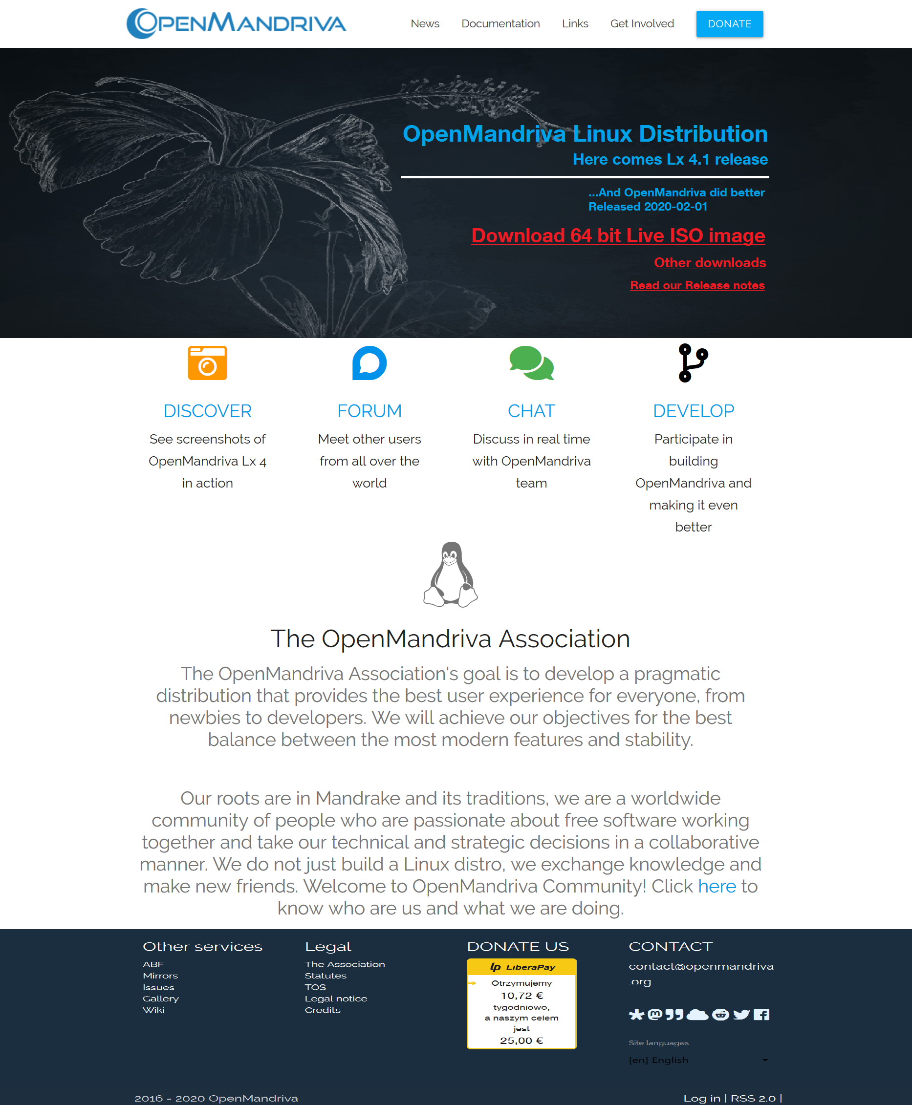
i’ve asked UX guys from my daily job, to run some audits and brainstorming on how to improve our landing page. Overall UX feedback was very positive, and they suggested couple of minor changes that may improve visitors experience with our main site:
0. Overall idea is to pack as much information on first fold of the site, and i guess we care for more downloads 1. Remove as many blank spaces and spacings as possible 2. Reduce the wiegth and height of glorious (that blueish flower background) 3. Add H1 (OpenMandriva Linux Distribution) ← very important for SEO 4. Add H2 (Here comes Lx 4.1 release) ← very important for SEO 5. Add H3 (…And OpenMandriva did better) ← very important for SEO 6. Add text Released 2020-02-01 7. Add direct link to our 64 bit ISO (user clicks on URL and browser download’s window apperas…) 8. Add Other downloads (user clicks and got redirected to OpenMandriva) 9. Add Read our release notes (user clicks URL and PDF opens https://www.openmandriva.org/IMG/pdf/4.1releasenotes.pdf)
Below you can find a suggestion how our landing page should look like. Orcourse RWD should be supported.
Tux is Back ! all he needs is his Top Hat !
Page looks ok to me ,it’s very Professional ,The photo negative and flat graphics are popular these days
Very nice first impression . The OpenMandriva at the top of the page is a little small though IMO.
and a slight reduction in the size of the flower is not a bad idea , raise it up a little reduce the size a bit
and let the bottom leaf show.