Nobody shows off anymore!

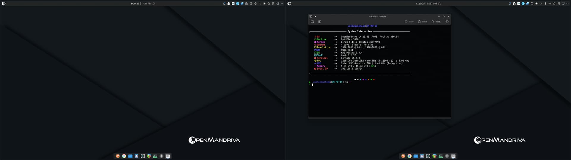
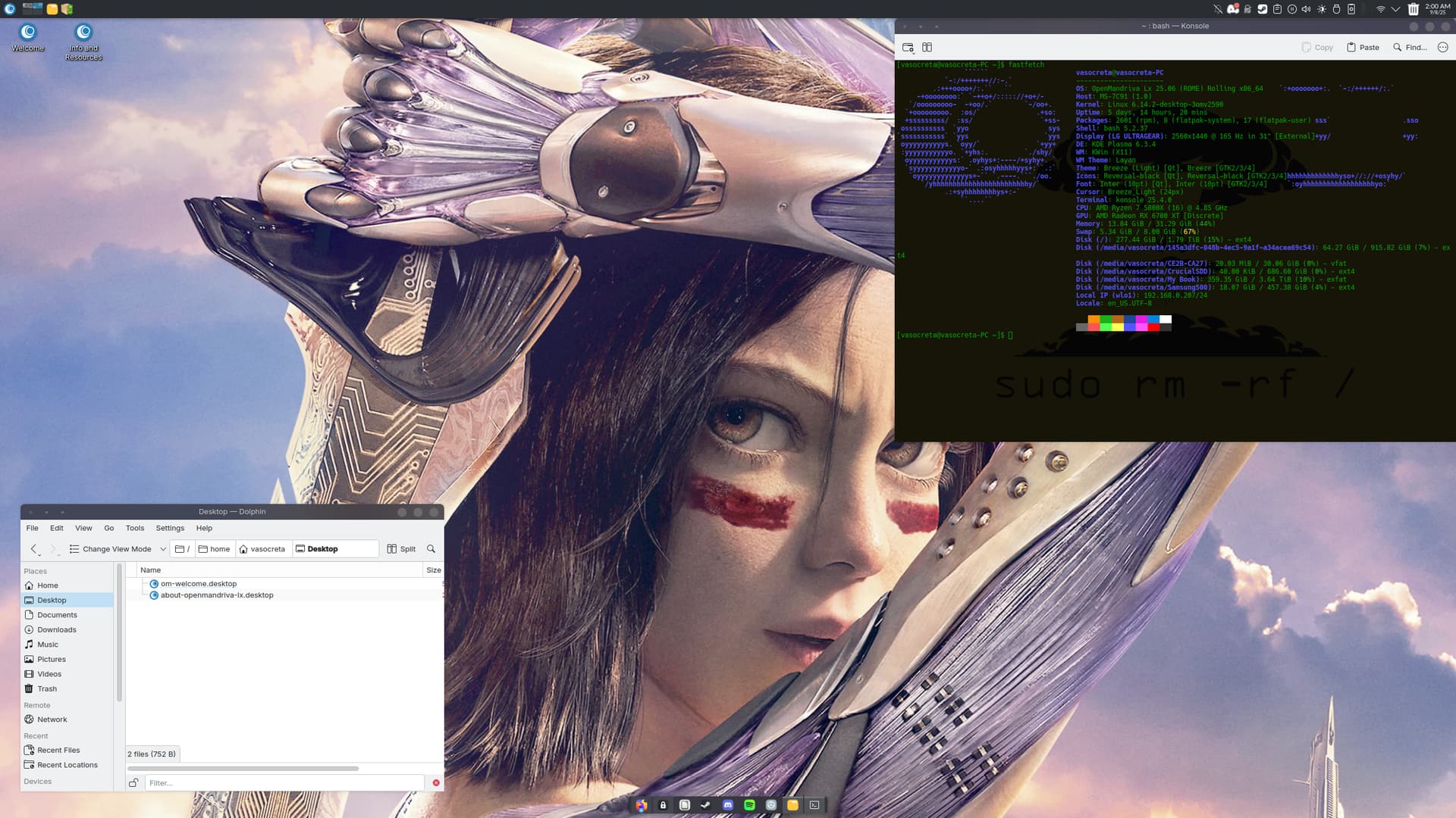
I got to noticing that not too many people seem to show off their rice anymore unless they use Arch, btw.
I was about to log off and go downstairs when I got mesmerized at this wallpaper and how if you stare at it just long enough you can almost see the ripples on the water moving. I dont remember where I got it from, as I dont remember where I got 90% of my wallpapers, lol.

And for those of you who want the wallpaper.

We need to get back to showing our stuff off while we wait patiently for the next version of OM with our fingers crossed that it includes Xlibre.

SO, WHIP OUT THOSE SCREENSHOTS PEOPLE!

8 Likes

Just boot a live ISO and you have my desktop. I’m too busy for anything else lol.

9 Likes

But you’re doing the important work!

That is a matter of perspective. I appreciate the sentiment, though.

1 Like

My desktop:

3 Likes

Hi,
Could you provide a link to the wallpaper?
I think the forum reduces the quality to speed up loading.

I dont remember where or when I got the wallpaper.
All I can do is upload it here.

Looking good!
Love the panel.

Here’s my dual monitor setup. I have the conky widget set on the left-hand border of my right monitor.

5 Likes

Dont see a lot of conky anymore.
That looks nice and clean!

Publish your OpenMandriva cool desktop (not just the wallpaper) and we’ll share them at
https://x.com/theomjournal :wink:

Very simple, functional, and stable laptop screenshot.

2 Likes

I want your icon set and your *fetch icon!! :smiley:

Icons = Vivid-Glassy-Dark-Icons

Fetch logo = attached below


The first one is for lighter themes. The second is for darker :blush::+1:

3 Likes

What did you make different?

For the first one, I overlaid the flower and the OM logo on a white background, and then used Gimp to make the background transparent. The result is that the blue of the OM logo is a bit lighter, so if you use the 1st logo on a dark background, the lighter blue portion shows a bit more. The second one, I did the same process, but on a black background, so when you have that one sitting on a dark background, it looks better.

Here are a couple of screenshots to show the difference. First…the dark background logo on a dark background…

Next, the light background logo on a dark background…

The difference isn’t major…but it was enough to kind of annoy me and redo things. I decided to save the light background version just in case I ever want to go with a light theme down the line.

2 Likes